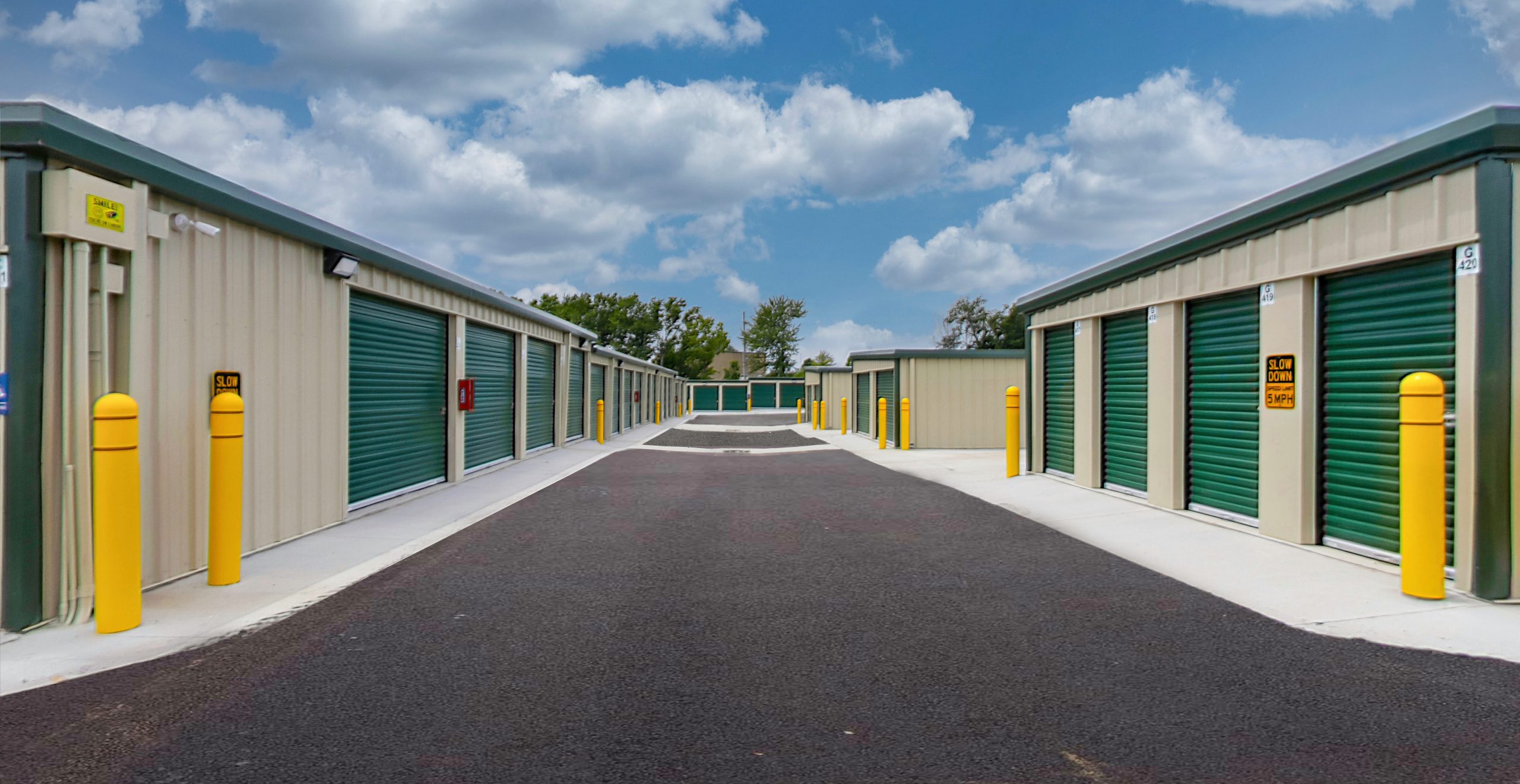
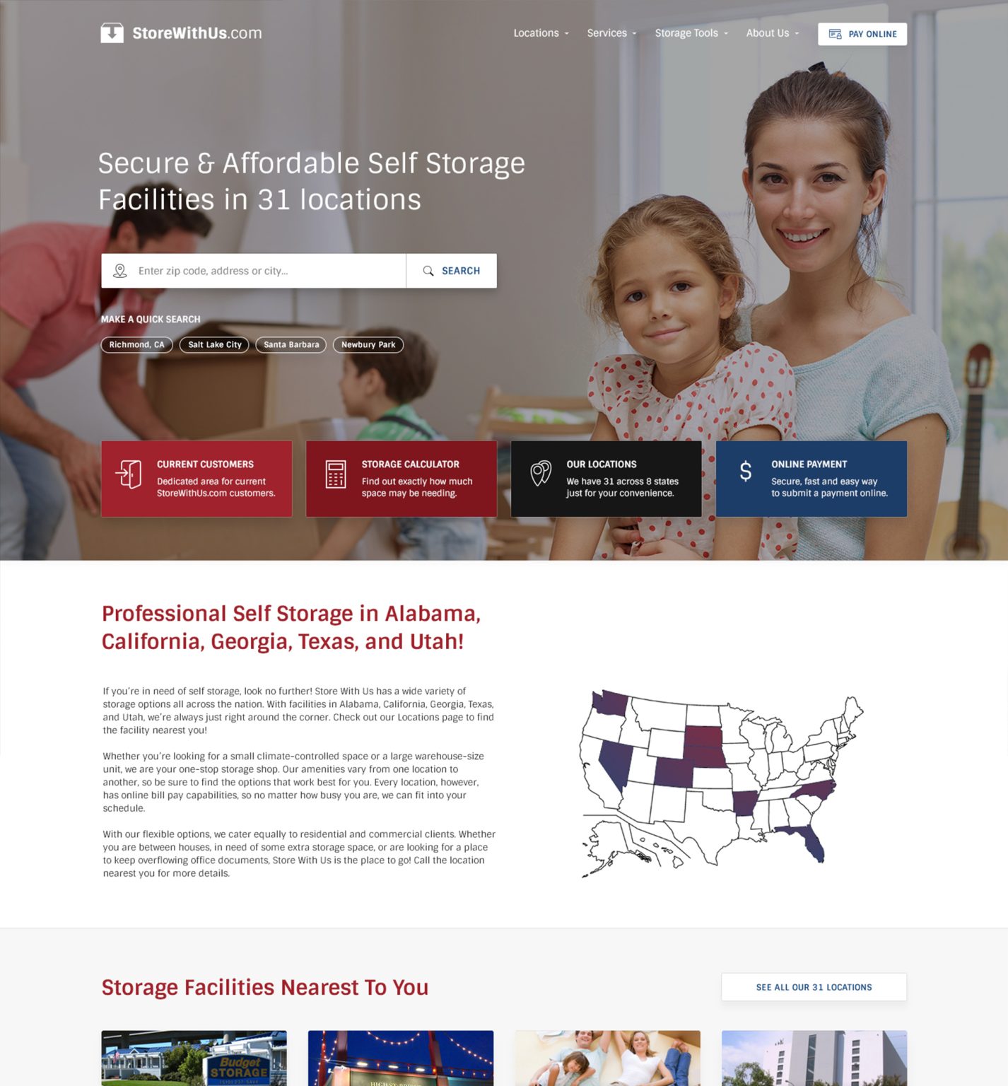
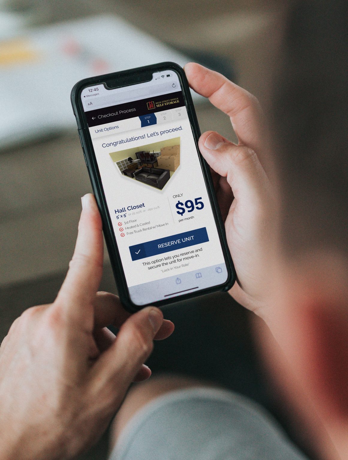
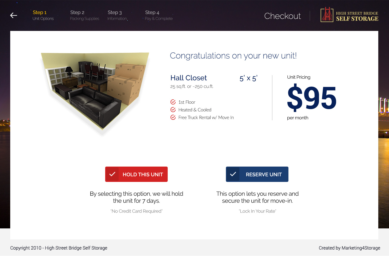
In collaboration with M4S, we helped multiple self storage services in the US drive results sales with better design.

The Challenge
M4S needed better designs for their clients' websites to drive more engagement.
The project required a careful balance between enhancing user experience and adhering to each client’s individual branding as we progressed in redesigning the websites.
Understanding the self-storage industry from a marketing stand point was crucial, in addition to the diverse needs of each client.

Goal
To transform the clients websites into user-friendly, visually appealing platforms that enhance customer engagement and streamline the self-storage rental process.
We aimed to create cohesive and intuitive designs that not only improved functionality and navigation but also reflected each client’s unique brand identity. By delivering consistent and high-quality designs, we sought to help M4S’s clients stand out in the competitive self-storage market and provide end users with a seamless online experience.
Result
Our client observed increased user satisfaction, higher conversion rates, and positive feedback from both clients and their customers.
We helped M4S’s clients establish a stronger online presence and effectively compete in the self-storage market.
Elevating User Experience and Brand Identity for Self-Storage Providers


Elevating User Experience and Brand Identity for Self-Storage Providers


