Symbolizes unity and regional pride, reflecting the identity and solidarity of the southernmost atolls.

Challenge
Our client needed a brand identity that highlights the solidarity and unity of three distinct atolls.
As a newly established sports club, South Blues required a strong brand identity that highlights the unity of the three southern atolls, which make up the South Police Division.
Emphasizing this solidarity, our design needed to be scalable, allowing it to seamlessly expand across various brand collaterals and mediums. Ensuring versatility and adaptability was key to meeting the club’s needs effectively.
The Solution
In response to the challenge of creating a cohesive brand identity for the sports club, we focused on creating a relatable and simple mark. We aimed to capture both the regional significance and the organization's distinctive color.
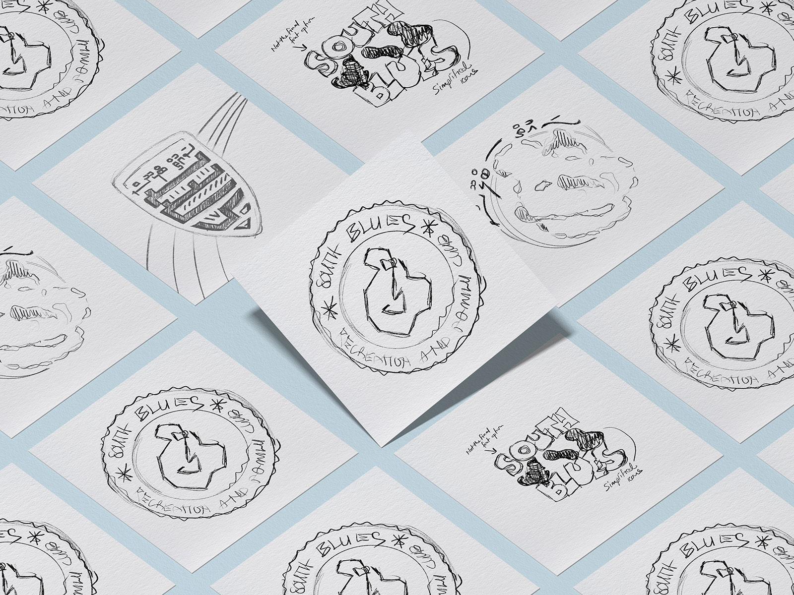
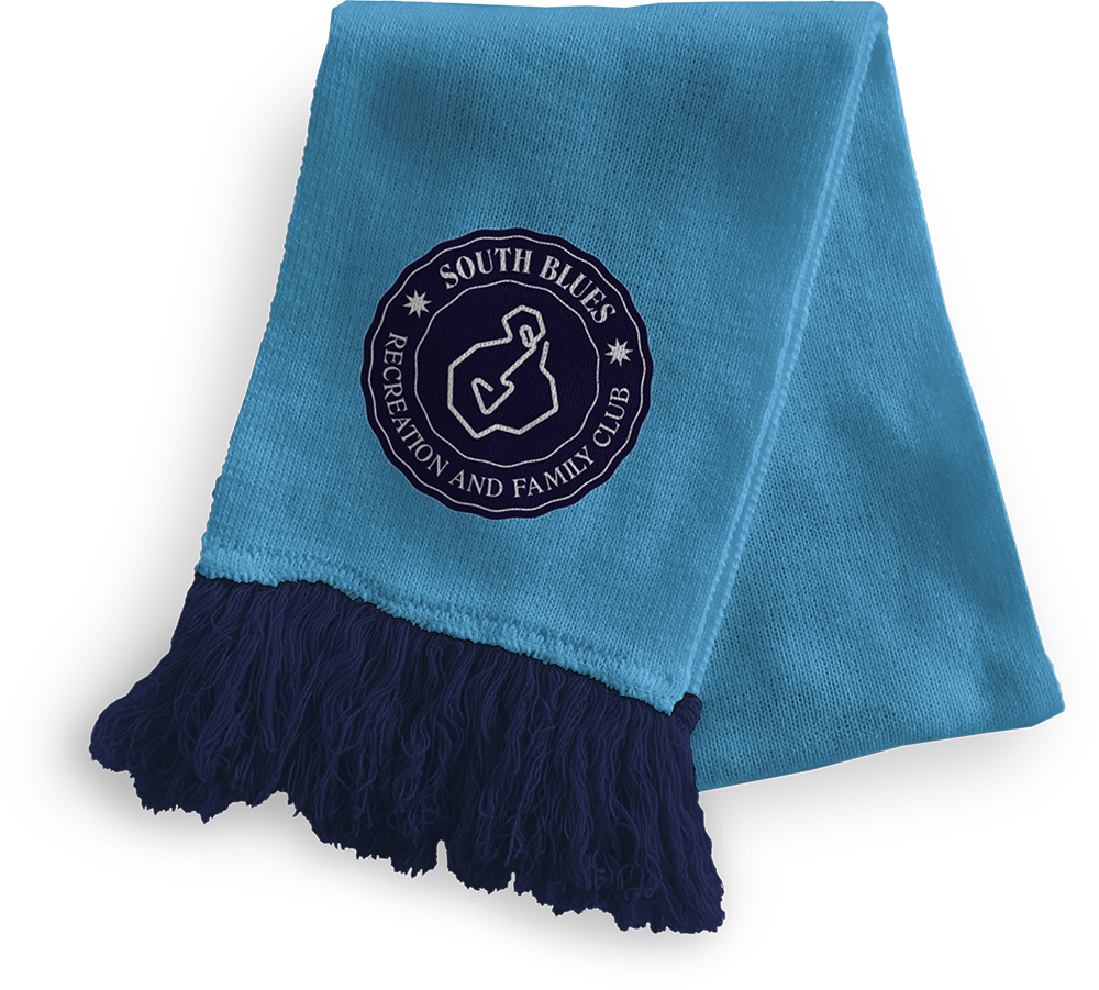
We devised a branding strategy that combined the geographical shapes of Huvadhoo, Fuvahmulah, and Addu into a single, unified mark. The blue color palette and wavy lines were chosen to symbolize the surrounding ocean and be relatable to the colors of the Maldives Police Service.
This approach resulted in a strong, recognizable brand that embodies the unity and spirit of the region it represents.
